You know that feeling when you’re scrolling and suddenly stop? Just… stop. Something caught your eye. A color. A shape. A product that looked too good to ignore. That’s not an accident. That’s design doing exactly what it’s supposed to do.
Graphic design is everywhere. Everywhere. The icon you tap without thinking. The coffee cup in your hand. The website that loads and just feels right. You don’t even notice most of it. But it’s working on you the whole time.
So let’s talk about it. Real talk, real examples. We’re covering branding, minimalist logos, digital marketing, web layouts, packaging, typography, and print. Grab your coffee. Let’s go.
1. Branding Design Examples That Build Lasting Recognition
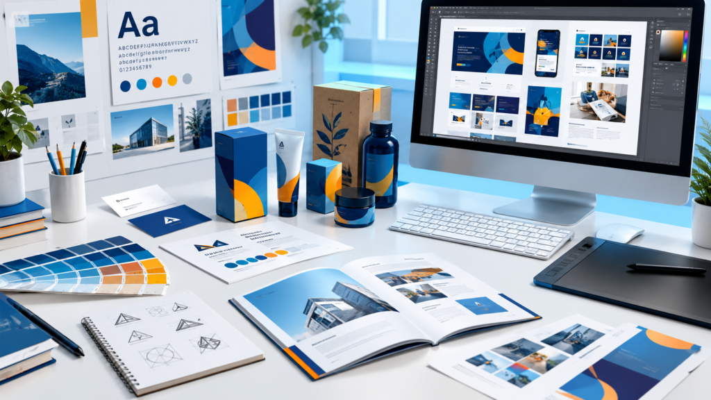
Branding isn’t a logo. It’s not a color palette either. It’s way bigger than that. Instead, it represents the whole personality of a business, squeezed into something you can actually see. The fonts. The colors. The spacing. All of it. Working together. Saying “this is us” before you’ve even read a word.
Great branding does two things well. One, it looks the same everywhere. Website, Instagram, storefront, shipping box, doesn’t matter. Two, it feels real. Not trendy for the sake of being trendy. Just real.
Try this. Picture a brand right now. Just from its color. No logo, no name. Bet you got one instantly, right? That kind of recognition isn’t luck. Someone planned every bit of it.
So what actually makes branding examples click?
- A color scheme that shows up the same way, every single time
- Fonts that match the brand’s actual personality, not just whatever looked cool
- A visual voice that feels identical on a phone screen and on a physical product
- Imagery that feels like it belongs in the same family, not five random stock photos slapped together
And good branding bends. What works for a tiny local bakery is not going to work for a massive tech company. Obviously. The best branding examples feel custom made, not copy pasted off some template site.
If you want to apply these visual concepts to grow your brand, check out our guide on Best Graphic Design Services for Small Businesses to see how professional assets drive real business growth. Honestly? Put the time in. It pays off. Consistent branding builds trust. And trust is what turns a one time visitor into someone who keeps coming back.
2. Minimalist Logo Design Examples Worth Studying
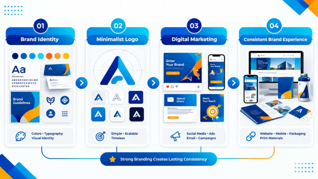
There’s something almost magic about a logo that says everything using next to nothing. Minimalist logo design gets so much respect, and it deserves it. It forces a designer to cut everything unnecessary. No fluff allowed. Just the core idea, stripped bare.
Study a few good ones and patterns start popping out. Negative space hiding a second image inside the first. Sneaky, right? Perfect symmetry that just feels solid. Simple shapes, circles, triangles, clean lines, doing all the work instead of some overly fussy illustration. The result doesn’t age. It just sits there, timeless, decade after decade.
Here’s why minimalism keeps winning. In fact, it scales. A logo built from one clean shape and a tight palette looks just as sharp on a tiny business card as it does blown up on a billboard. Complicated logos? They fall apart the second you shrink them. And these days, most people meet your brand as a tiny icon on their phone screen first. Not a billboard. A tiny icon.
To understand how legendary branding works in practice, look at how Famous Graphic Designers Who Shaped Modern Design built timeless logos that still inspire creators today. Some of these logos are decades old. Still working perfectly. Still recognizable at a glance. That tells you everything about simplicity done right.
What actually makes a minimalist logo example great?
- One strong idea. Not five fighting each other.
- Clean lines that hold up no matter the size
- A tight, purposeful color palette
- Works in full color, black and white, single tone, all of it, no exceptions
- A little cleverness tucked in somewhere, hidden imagery, smart negative space, something that makes you go “oh, nice”
And no, minimalism is not boring. That’s a myth. It’s disciplined. Everything left on the page earned its spot. That’s exactly why these designs last so long.
3. Digital Marketing Material Examples That Actually Convert
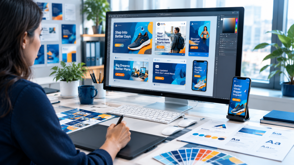
Digital marketing covers a lot. Social posts, email banners, digital ads, app alerts, the whole mix. Unlike branding, which plays the slow long game, marketing design has one job. And it needs to do it fast. Stop the scroll. Say the thing. Get the click. Simple as that.
The best examples nail their hierarchy instantly. You look, you know where to look first, you know what it’s saying, you know what to do next. Zero confusion. None.
So what separates the good stuff from the forgettable stuff?
- Bold headlines readable in two seconds flat, even on a tiny phone
- Strong contrast so nothing gets lost in the background
- Clean layouts, not ten messages crammed into one square
- A call to action nobody can miss
- Visuals built for the exact platform they’re living on, because Instagram and email are two totally different beasts
Motion’s crept into this too, and it’s staying. Small animations. Subtle transitions. A button that pulses just enough to catch your eye. Tiny touches, but they keep people looking a second longer in a feed that’s fighting hard for their attention every single moment.
Ultimately, good marketing design respects its home.. A social post has to land in a blink. An email can breathe a bit more. Knowing that difference? That’s what separates real results from just making pretty pictures nobody remembers.
4. Modern Web UI/UX Layout Examples That Improve User Experience
Website design sits right at the crossroads of “looks amazing” and “actually works.” Here’s the hard truth though. A gorgeous site that confuses people is a failed site. Full stop. No exceptions. The best web examples manage both, somehow. Beautiful and genuinely usable.
Furthermore, modern layouts lean hard on white space. Instead of cramming every pixel, good designers leave room to breathe. That empty space isn’t wasted. It’s pulling your eye exactly where it needs to go. Clean navigation helps too. So does branding that stays consistent as you scroll down the page.
And mobile? Not optional. Most people browse on their phones now, so a layout has to hold up on a small screen just as well as a giant monitor. A site that looks stunning on desktop but falls apart on mobile isn’t doing its job. Doesn’t matter how much creative effort went into it.
What keeps showing up in strong UI and UX design?
- Navigation that makes sense without a tutorial
- Visuals that load fast without losing any quality
- Smart white space instead of clutter everywhere
- Small interactive touches, hover effects, smooth scrolling, that add polish without being annoying
- Accessible choices, readable fonts, solid contrast, for users who actually need it
- A clear path leading people toward the one action you want them to take
Funny thing about great UX. Nobody notices it. Users just glide through, find what they need, move on with their day. That invisibility? That’s the whole point.
For deeper visual case studies and global creator portfolios, you can also explore trending showcases on Behance to analyze modern UI and print trends. Seriously, it’s one of the best spots to see what talented designers worldwide are cooking up right now, bold asymmetrical grids, soft rounded interfaces, all of it. And if you’d rather hand this off to people who eat, sleep, and breathe this stuff, our team offers professional graphic designing solutions built around how your actual audience browses and clicks.
5. Product Packaging Design Examples That Sell Before a Word Is Read
Packaging is such a weird, wonderful mix of creativity and pure practicality. It has to protect what’s inside. It has to follow size and material rules nobody thinks about. And on top of all that, it still needs to grab attention on a crowded shelf, or worse, in a sea of near identical thumbnails online. That’s a lot to ask from one little box.
Some packaging plays with unexpected shapes. Other brands go bold with type. Meanwhile, many designers strip everything back and lets the product just speak for itself. Others turn the whole thing into a storytelling canvas, walking you through the brand’s mission right there on the box.
Color does most of the heavy lifting here. Earthy, muted tones usually mean natural. Bright, loud colors say fun, energy, grab me. People judge products on color alone. Instantly. Before reading a single word on the label. That’s how strong this stuff is.
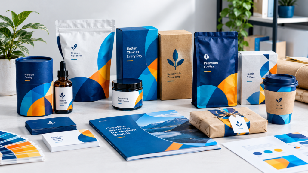
What actually makes packaging memorable?
- Shapes or textures that stand out from everything sitting next to it
- Type you can read at a glance, no squinting
- Colors that genuinely match the product and its audience
- Small functional wins, resealable bags, easy open tabs, little things that make life easier
- Thoughtful design on every surface, not just the pretty front label
Sustainability’s a big deal now too. More brands are switching to recyclable materials and simpler designs that cut down waste while still looking sharp. Proof that great design never just sits still.
Bottom line? Packaging is often the last thing standing between a browsing customer and an actual decision. That’s a lot of pressure riding on one little box.
6. Typography Examples That Elevate Every Design
Typography is sneaky. People notice it without even realizing they’re noticing it. The right font can make something feel elegant, playful, serious, calm, whatever, without changing a single image or color. That’s the quiet power hiding in plain sight.
Additionally, strong typography follows a hierarchy. Headlines grab you first. Subheadings fill in the blanks. Body text stays easy on the eyes so nobody’s squinting halfway through a paragraph. Mix the weights and sizes thoughtfully, and suddenly there’s a rhythm pulling your eye through the whole thing naturally.
Hand lettering’s had a real moment too, especially in branding and packaging, because it adds a one of a kind feel a stock font just can’t fake. Meanwhile clean sans serif fonts still rule the digital world, mostly because they read so well on screens of every size.
What actually makes typography excellent?
- A clear hierarchy guiding the reader without them even noticing
- Careful spacing, because tiny letter and line adjustments change everything
- Font pairings that work as a team, not a tug of war
- A tone that actually matches the brand, serious, friendly, bold, whatever fits
Good typography isn’t just pretty on a mood board. It makes the message land better. That’s exactly why it deserves way more credit than it usually gets.
7. Print Design Examples That Still Matter Today
Everything feels digital now, sure. But print design? Still very much alive. Business cards, brochures, posters, packaging inserts, all of it leans on solid print principles. And honestly, holding a well designed piece in your hands hits different than any screen ever could.
The best print work knows its limits. No scrolling. No zooming. No clicking around to find more. Everything has to land inside a fixed space, which means layout and hierarchy matter even more than they do online.
Texture matters a ton here too, way more than in digital work. Paper weight. The finish. Small details like embossing or foil stamping. All of it shapes how premium a brand feels the second it’s in someone’s hands.
What shows up again and again in strong print design?
- Layouts that guide the reader logically from start to finish
- Imagery that stays sharp even at full print size
- Colors that translate accurately from screen to paper
- Finishing touches, texture, material, that change how a piece feels entirely
Print also demands precision digital just doesn’t. Once it’s printed, it’s printed. No quick fix. No undo button. That’s exactly why careful planning and proofing matter so much in this world.
Final Thoughts
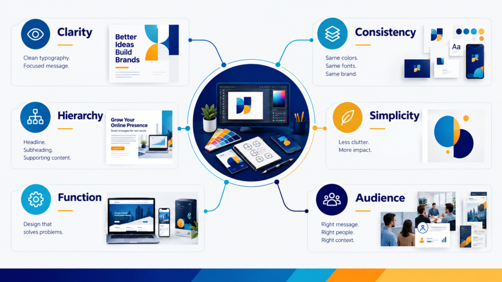
Look back at everything. Branding, minimalist logos, digital marketing, web layouts, packaging, typography, print. One thread ties it all together, every single time. The best graphic design examples never feel like an accident. Every color, every shape, every font choice is there on purpose. Working to say something real to whoever’s looking at it.
Studying examples like these sharpens your eye. Whether you’re refreshing an old brand, building something brand new, or just trying to figure out why some visuals stick and others just vanish. Good design was never about chasing trends. It’s about understanding your audience and talking to them clearly, honestly, in a way they’ll actually remember.
So wherever you’re working in this space, keep coming back to the basics. Clarity. Consistency. Authenticity. Those three things will outlast whatever’s trending this month. Guaranteed.