Quick test. Think of the last website you bounced from in about three seconds. Not because of anything you could name. It just felt off.
Yeah. Your customers do that too.
Let’s be honest, most business owners don’t lose customers because their product is bad. They lose them because of a first impression they never knew they made. A wonky logo. Colors that clash. A Facebook page that looks nothing like the website. People shrug, move on, and never say a word.
That’s why graphic design and branding services deserve a real seat at the table. I’ve sat across from a lot of founders over the years, and the story repeats. Great work, shaky visuals, quiet frustration. So let’s skip the fluff and talk about how branding actually works, where people trip up, and what to do about it.
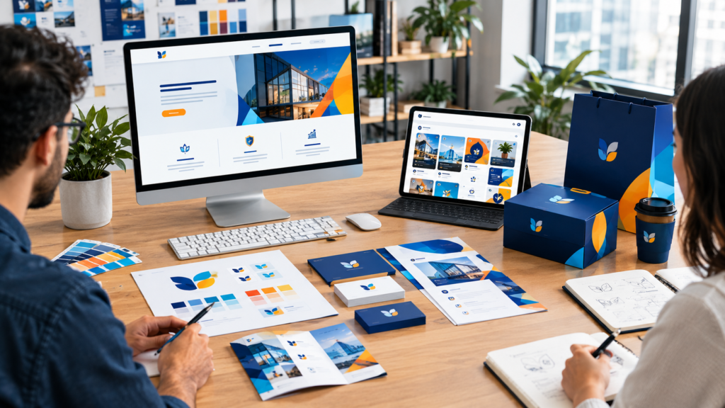
Your brand talks before you do
Picture a homeowner at 9 at night with a leaking pipe. She searches, finds two plumbers. One has a blurry logo, a site that looks like it’s from 2011, and social pages in three different color schemes. The other looks tidy and calm.
Both could be brilliant at their jobs. She calls the second one. Every time.
Is that fair? Not really. But it’s human. Nobody has hours to research every business, so people grab whatever clues they can, and visuals are the loudest clue on the table. Good design won’t rescue bad service. What it does is earn you the chance to prove yourself.
There’s another piece that gets overlooked, which is memory. People see dozens of businesses in a week and forget most of them. The ones that stick usually have a look they can recognize at a glance. Same colors, same tone, same feel, everywhere. That’s how “oh, the one with the green van” happens, and you can’t manufacture that kind of word of mouth any other way.
And here’s the part small business owners should love. A sharp brand levels the field. You might have three people on your team. The big competitor down the road might have thirty. On a phone screen, at the moment someone’s deciding, you can look every bit as solid. At the end of the day, that’s a serious advantage.
The template trap (we’ve all been there)
You needed a logo quickly. Maybe you were launching in a week. You found one of those online logo makers, clicked through a few icons, picked a font, and boom, file downloaded. Ten minutes.
No judgment. Really. It’s the most common starting point we see.
Here’s what tends to happen next.
Somebody else has your logo. Or something close. These tools draw from the same small pool of icons, so a coffee shop in your town and one three states over can end up with nearly the same cup and swirl. Customers notice. Competitors definitely notice.
It breaks in the real world. A thin script font looks gorgeous on a laptop. Then your sign painter tells you it vanishes from across the road. Or you try printing it on a shirt and the details turn to mush.
It says nothing about you. A template has no idea whether you’re the warm neighborhood favorite or the serious specialist. It just fills a shape.
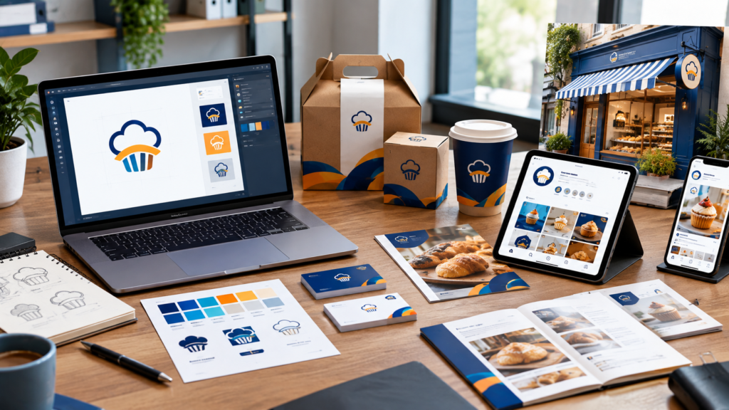
Take a bakery owner who does exactly this. Half a year in, she wants new boxes, a fresh signboard, and an online shop. Every single file needs redoing because her original logo only exists as one small image. The shortcut became a detour. A long one.
If you’re still comparing options, our breakdown of the Best Graphic Design Services for Small Businesses covers what to look for before you hire anyone.
What a professional branding agency actually does
Straight talk. A logo is one piece of the puzzle. A brand is the whole picture.
When you work with a professional branding agency, the job usually covers a few connected things.
A custom logo. Good custom logo design services start with questions, not sketches. Who are you talking to? What do you want to be known for? What are your competitors doing that you’d rather avoid? The finished mark should be simple enough to remember and flexible enough to sit on a tiny social icon and a huge storefront sign without falling apart.
A visual identity. Colors, fonts, image style, little graphic touches that tie everything together. It’s the gap between a logo that sits by itself and a business that looks like one confident thing.
Brand guidelines. Terrible name, super useful document. It tells you, your printer, your freelancer, and your next hire exactly how to use your logo and colors. No guessing.
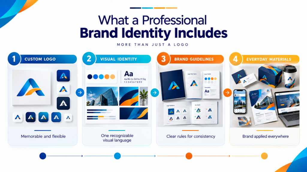
Everyday materials. Business cards, flyers, packaging, social posts, banners. The stuff people actually hold and scroll past.
Small business graphic design sometimes gets treated like a lighter version of “real” branding. Nope. You’ve got fewer resources, so every design choice has to work harder. That’s the whole point.
How the process works (no mystery, promise)
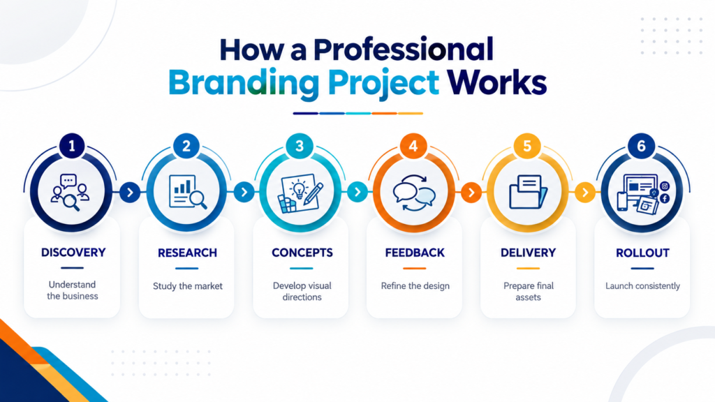
A lot of owners picture branding as a designer vanishing for a month and coming back with a big reveal. That’s not how a good project runs. Here’s the normal flow.
1. Discovery. A proper conversation. We ask about your customers, your story, and what bugs you about your current look. This step matters more than any software.
2. Research. We study your market and your competitors. If every dentist in your city uses blue and a tooth icon, well, that tells us where the open space is.
3. Concepts. A few directions, each with a reason behind it. Not fifty. Too many options just makes people freeze.
Quick tip you can use today. Before this stage, spend twenty minutes on Behance and save a handful of branding projects you love. Then save two you really dislike. Honestly, the dislikes help designers more than the likes do.
4. Feedback. You react, we adjust. Spacing, shapes, color balance, all the small stuff that makes a design click. Be blunt with us. “I can’t say why, but it feels cold” is perfectly useful feedback.
5. Delivery. You get your logo in every format you’ll need, plus your colors, fonts, and guidelines.
6. Rollout. A brand nobody sees isn’t doing anything. We help put it on your website, social profiles, and printed pieces so it all launches together instead of leaking out one piece at a time.
Color: choose a mood, not a favorite
Most owners pick brand colors the way they’d pick paint for the living room. Whatever they like. Natural instinct, usually the wrong move.
Colors carry meaning. Blue tends to feel calm and dependable, which is why so many clinics and banks lean on it. Green points to nature, health, growth. Red is loud and urgent, great for food and sales, exhausting for a meditation studio. Yellow feels warm but can tire the eyes. Black and deep neutrals feel polished and premium.
None of that is law. Context changes everything. Still, it’s a handy filter.
A better question than “what do I like?” is “what should someone feel in the first three seconds?” A kids’ tutoring center and a law firm shouldn’t feel alike. Then keep the palette tight. One main color, a couple of helpers, one neutral. Done. Brands that use eight colors tend to look like a school project.
Typography: the thing nobody notices until it’s wrong
Fonts get ignored. Then a menu turns out to be impossible to read, or a flyer looks oddly childish, and suddenly everyone has opinions.
Think of a font as the voice of your written words. Same sentence, different font, whole different personality. A blocky sans-serif sounds direct and modern. A classic serif sounds established. A loopy script sounds personal, but a full paragraph of it is a headache.
A few habits worth stealing:
- Test it on a phone. If you’re squinting, it’s wrong.
- Stick to two fonts. One for headlines, one for body text.
- Watch the hierarchy. Size and weight tell people what to read first.
- Check it small. A tiny business card exposes a weak font fast.
Consistency is where trust gets built
This is the step most small businesses skip, and it quietly hurts them.
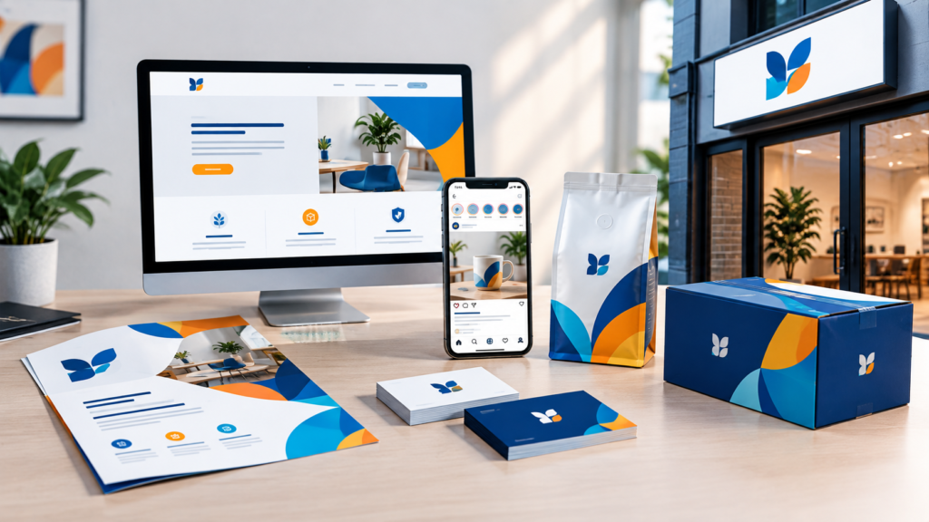
Say a customer finds you on Instagram, clicks through to your website, then later picks up a printed flyer. If the logo looks slightly different each time, the colors drift, and the writing sounds like three different people, a small doubt creeps in. Same company? Nobody thinks it consciously. They just feel a little less sure.
When everything matches, the opposite happens. Each touchpoint reminds them of the last one, and familiarity slowly turns into trust.
A few habits that help:
- Keep one folder of approved logo files and share it with anyone who touches your marketing.
- Use the same colors and fonts on print, web, and social.
- Pick a voice (friendly, expert, playful) and stay with it.
- Glance over anything new before it goes live. Two minutes now saves a mess later.
The biggest cause of messy branding? A helpful cousin, employee, or freelancer who “just whipped something up” without the files. It happens in nearly every business. Guidelines stop it cold.
Mistakes we see all the time
Some of these might sound familiar.
Copying a bigger competitor. Feels safe. Actually makes you the knockoff.
Redesigning every year. Customers never get the chance to learn your look.
Cramming everything in. A logo showing your product, your city, your founding year, and your slogan is a logo nobody remembers.
Skipping file formats. No clean version for print, web, and dark backgrounds? You’ll feel it later.
Waiting for perfect. Launch something clear and simple, then improve it as you grow.
Make sure your website matches
A polished identity shouldn’t live only on business cards. Your website is usually where people meet you first, so it has to tell the same story. If your site looks like it belongs to a different company, our web design services can bring everything into line. And once your brand looks right, our digital marketing services help the right people actually find it.
Why businesses choose Kptl Services
Plenty of agencies out there, so here’s what you can expect from us.
We don’t recycle looks. Every project starts with your goals and your customers, so what you get is built for you, not adapted from something we made last week.
Design, web, and marketing all live under one roof. Your logo, your site, and your campaigns get planned together, which avoids that patchwork feeling you get when three separate vendors each do their own thing.
We explain our thinking in plain language. If we picked a color or a shape, we’ll tell you why. And if you disagree, we listen and refine.
We also design for the long haul. A brand should still feel right in five years, not just this season.
That’s really it. We want people to look at your business and get it, quickly and without effort.
Let’s build something people remember
Good design isn’t decoration. It’s how your business talks when you’re not in the room. When your visuals are clear and consistent, customers trust you sooner, remember you longer, and choose you more often.
Ready to start? Send us a note through our contact page or write to support@kptlservices.com.
Want to elevate your brand identity? Get in touch with our expert designers at Kptl Services today.